Settings
Settings is a floating panel with five tabs: Appearance, Arrows, Audio, Library and Scale. Every control writes through the moment you touch it — there is no OK, no Apply and no Cancel. Your settings persist in the browser, so the app you come back to is the app you left.
Open it from the gear
Click the gear in the top bar, between the Playhead Tracking toggle and the "+" menu. Click it again to close the panel.
The gear turns red while the panel is open, so you can always tell.
There is no "Settings…" menu entry.
The gear is the only way in. Do not go looking for Settings in the "+" menu — it isn't there.
Three other ways to close the panel:
| Action | Result |
|---|---|
| Click the × in the panel header | Closes |
| Click the gear again | Closes |
| Press Escape while focus is inside the panel | Closes — but if focus is in a text, number or select field, Escape blurs that field instead and the panel stays open. Press it twice to close the panel from there |
Escape pressed anywhere else in the app does nothing to the panel. Its key handler is scoped to the panel itself; see Keyboard Shortcuts.
The panel is not a modal
It floats. It does not dim or block the app behind it, and it does not stop you composing. You can leave Settings open, drag a note, hear the change, and nudge a slider again — which is the point.
- Drag it by its header to move it anywhere. On a phone, drag it with your finger; it stays a floating card and never becomes a full-screen sheet.
- First open parks it top-right, clear of the top bar and the module library.
- Click it to bring it to the front. The panel shares one stacking order with the note widget, the group widget and the "+" menu — whichever you touched last is on top, so nothing can get trapped underneath.
- Dragging it low shrinks it rather than pushing it off the bottom of the screen; its body scrolls.
- Its position survives closing and reopening the panel, but not a page reload.
Changes apply immediately — and cannot be undone
Every control writes to the settings store on change. The store re-validates, persists, and tells the theme manager, the renderer, the audio graph, the module library and the scale sliders to catch up. You see the result at once.
Undo does not cover settings.
Ctrl/Cmd+Z undoes changes to your module, not to your settings. The only way back from a settings change is to set the value again by hand, or to use one of the reset buttons — each of which is behind a confirmation and is itself irreversible.
Appearance
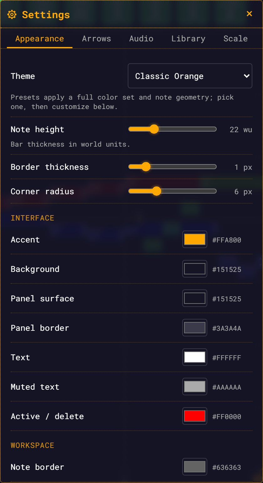
| Control | Range | Default |
|---|---|---|
| Theme | Classic Orange, Slate Cyan, Mono Light, High Contrast | Classic Orange |
| Note height | 8–60 world units, step 1 | 22 wu |
| Border thickness | 0–6 px, step 0.5 | 1 px |
| Corner radius | 0–20 px, step 1 | 6 px |
| Colour pickers | 15 pickers in three groups | per theme |
| Reset colors to theme | button, disabled when you have no custom colours | — |
The three geometry sliders reshape every note on the canvas live — and picking a theme preset re-seeds them with that preset's declared geometry. The theme dropdown and the colour pickers are covered in full, picker by picker, on Themes & Appearance.
Arrows
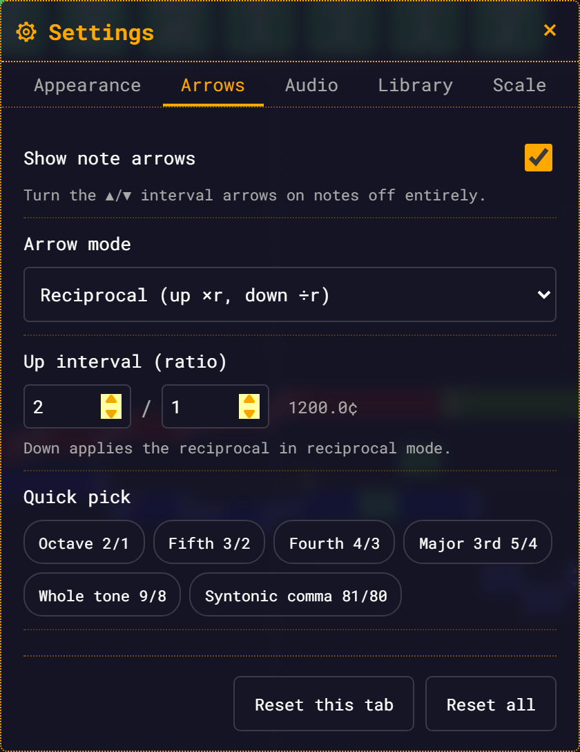
The ▲/▼ arrows on a note transpose it by an interval you choose. The default interval is the octave, 2/1.
| Control | Range | Default |
|---|---|---|
| Show note arrows | on / off | on |
| Arrow mode | Reciprocal (up ×r, down ÷r) / Independent up/down | Reciprocal |
| Up interval (ratio) | two whole-number fields, n / d | 2 / 1 (1200.0¢) |
| Quick pick | chips: Octave 2/1, Fifth 3/2, Fourth 4/3, Major 3rd 5/4, Whole tone 9/8, Syntonic comma 81/80 | — |
Set the ratio and the cents readout updates beside it. A ratio is only accepted if it is built from positive whole numbers, lands between 1/16 and 16, and is not 1/1.
A rejected ratio restores your previous value: an invalid field heals from the ratio you had before the edit, and a ratio that lands out of range reverts wholesale to it. The fields visibly rewrite themselves with the healed value.
In reciprocal mode, down is the reciprocal of up: set the up interval to 3/2 and ▼ divides by 3/2. The note widget's arrow buttons pick up the interval too — their tooltips read Transpose up ×3/2 and Transpose down ×2/3.
In Independent up/down mode, a Down interval (ratio) row appears below the up editor — its own two number fields and cents readout — so both directions are yours to set. In reciprocal mode the row is hidden, since down auto-derives.
Turning Show note arrows off does three things at once: the arrows stop being drawn, their click zones on the note disappear (no invisible dead spots), and the ▲/▼ buttons vanish from the note widget. The ratio controls stay editable while arrows are off — they just dim, and take effect when you switch arrows back on.
Audio
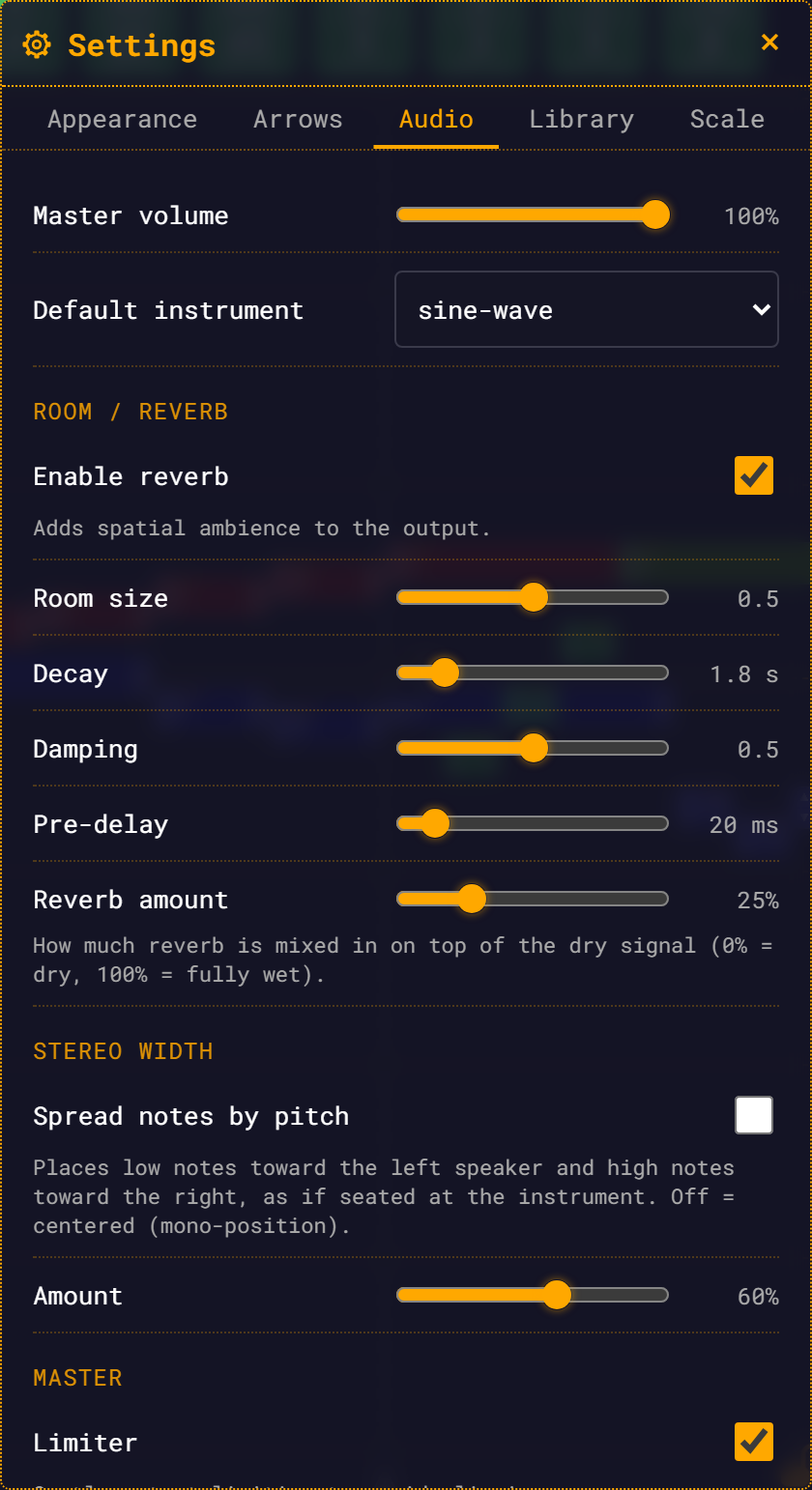
| Control | Range | Default |
|---|---|---|
| Master volume | 0–100%, step 1% | 100% |
| Default instrument | sine-wave, square-wave, sawtooth-wave, triangle-wave, organ, vibraphone, fm-epiano, piano, violin | sine-wave |
| Room / Reverb | ||
| Enable reverb | on / off | on |
| Room size | 0–1, step 0.01 | 0.5 |
| Decay | 0.1–12 s, step 0.1 | 1.8 s |
| Damping | 0–1, step 0.01 | 0.5 |
| Pre-delay | 0–200 ms, step 1 | 20 ms |
| Reverb amount | 0–100%, step 1% | 25% |
| Stereo width | ||
| Spread notes by pitch | on / off | off |
| Amount | 0–100%, step 1% | 60% |
| Master | ||
| Limiter | on / off | on |
Reverb, stereo and the limiter all apply live during playback.
Reverb is on by default at 25% wet — a little room, not a hall. Room size, Decay and Damping rebuild the reverb's impulse response, so they land a fraction of a second after you stop dragging; Reverb amount, Pre-delay and the on/off toggle are immediate.
Spread notes by pitch pans low notes left and high notes right, as if you were sitting at the instrument. It is applied when a note is scheduled, so it changes what you play next, not what is already sounding.
Default instrument is what a note plays when neither it nor anything it inherits from names an instrument — including the BaseNote. See Instruments.
The master volume knob is shared.
The volume slider in the top bar and Master volume here are the same number. Drag either and the other follows.
Library
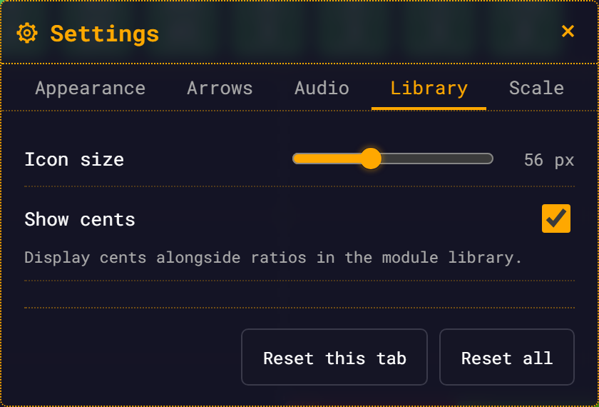
| Control | Range | Default |
|---|---|---|
| Icon size | 32–96 px, step 4 | 56 px |
| Show cents | on / off | on |
Both apply live to the module bar. The icon size drives everything that hangs off an icon — the delete ×, the drag ghost, the drop placeholder — so the whole grid scales together.
Scale
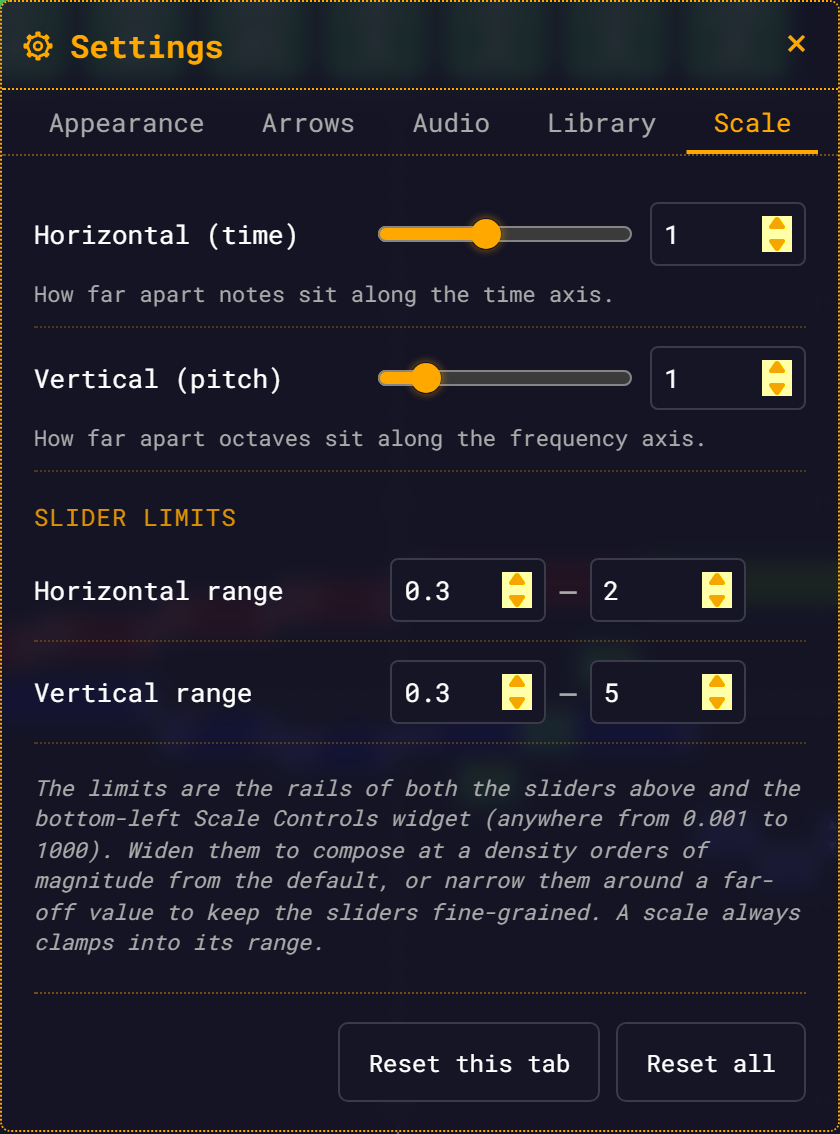
This tab is the other half of the scale controls in the bottom-left corner of the workspace. Both write the same two numbers, so whichever you touch, the other follows — they cannot drift apart.
| Control | Range | Default |
|---|---|---|
| Horizontal (time) | spans the horizontal limits below | 1 |
| Vertical (pitch) | spans the vertical limits below | 1 |
| Slider limits | ||
| Horizontal range | min and max, each 0.001–1000 | 0.3 – 2 |
| Vertical range | min and max, each 0.001–1000 | 0.3 – 5 |
Horizontal spreads notes out along the time axis; vertical spreads octaves out along the frequency axis. Your scale now persists across reloads — reload the page and you get the density you left.
Each slider is paired with an editable number box. Once the limits span a wide range the slider's detents get coarse, so the number box is how you land on an exact value. It clamps into the current limits: to go further, widen the limits first.
The limits are the rails of both these sliders and the bottom-left widget's sliders, and you can put them anywhere between 0.001 and 1000. Widen them to lay a composition out at a density orders of magnitude from the default; narrow them around a far-off value to keep the sliders fine-grained. Edit them and both sets of sliders retune live.
Two rules worth knowing:
- A scale always clamps into its range. Narrow the limits around a new region and an out-of-range scale value is pulled in with them.
- If you type a min above the max, the edit is not rejected. The field you just edited wins, and the other gives way by a factor of ten.
Resetting
At the bottom of every tab, below the controls and scrolling with them, sit two buttons.
| Button | What it resets | Confirm button |
|---|---|---|
| Reset this tab | every setting in the tab you are on | Yes, Reset Tab |
| Reset all | appearance, arrows, audio, library and scale | Yes, Reset All |
Both open a confirmation dialog with Cancel already focused. Dismiss it with Cancel, with Escape, or by clicking outside it. Both resets are irreversible.
The Appearance tab has a third, narrower reset — Reset colors to theme — which drops your custom colours but leaves the theme and the note geometry alone. See Themes & Appearance.
Where settings live
Settings are stored in your browser, under the key rmt:settings:v1, and are scoped to the site. That has consequences worth stating plainly:
- Settings are per browser and per device. A different browser, or a different machine, starts from the defaults.
- There is no import or export of settings, and no account sync.
- Settings are global, not per-module. Loading somebody else's module does not change your theme, your reverb or your arrow interval.
- Clearing site data resets everything to the defaults.
Stored settings are checked on load. An out-of-range or missing value is repaired field by field against the defaults, so one bad value never costs you the rest. Only if the stored data cannot be read at all does the app fall back to the defaults wholesale.
Next
- Themes & Appearance — the Appearance tab in full
- Transposing with Arrows — what the Arrows tab drives
- Audio and Effects — what the Audio tab drives