Themes & Appearance
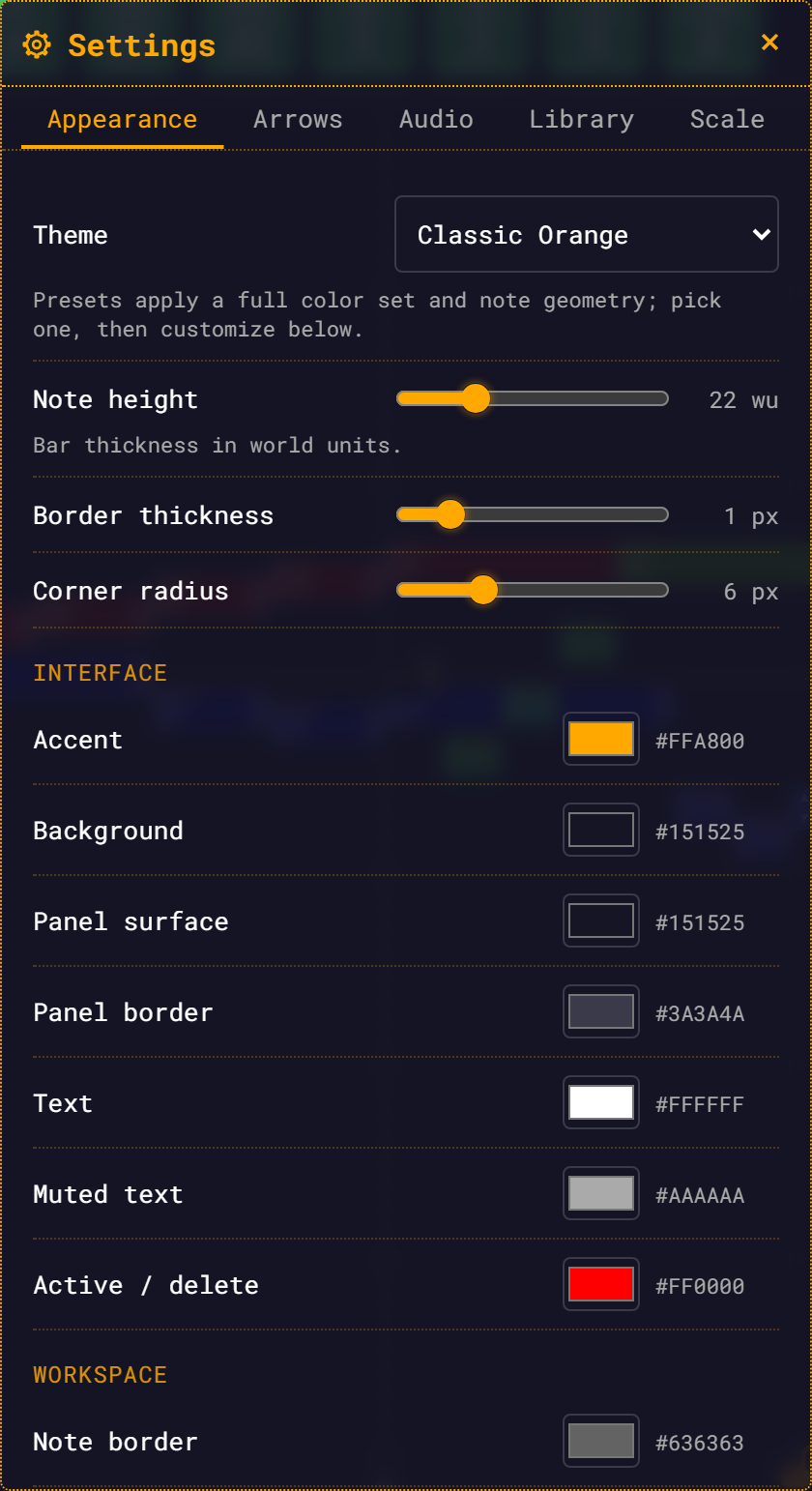
The look of the app is a theme: a set of colours plus three numbers that shape a note. You choose a theme from Settings → Appearance, then override individual colours if you want. Everything applies live and persists across reloads.
Open the Settings panel from the top-bar gear and stay on the first tab.
The four presets
| Theme | Character |
|---|---|
| Classic Orange | The original look: near-black navy canvas, amber accent. The default. |
| Slate Cyan | Cool and dark. Desaturated blue-slate with a sky-cyan accent. |
| Mono Light | The only light theme. Warm off-white paper, burnt-orange accent, near-black text. |
| High Contrast | Pure black background, white note borders, saturated yellow accent. |
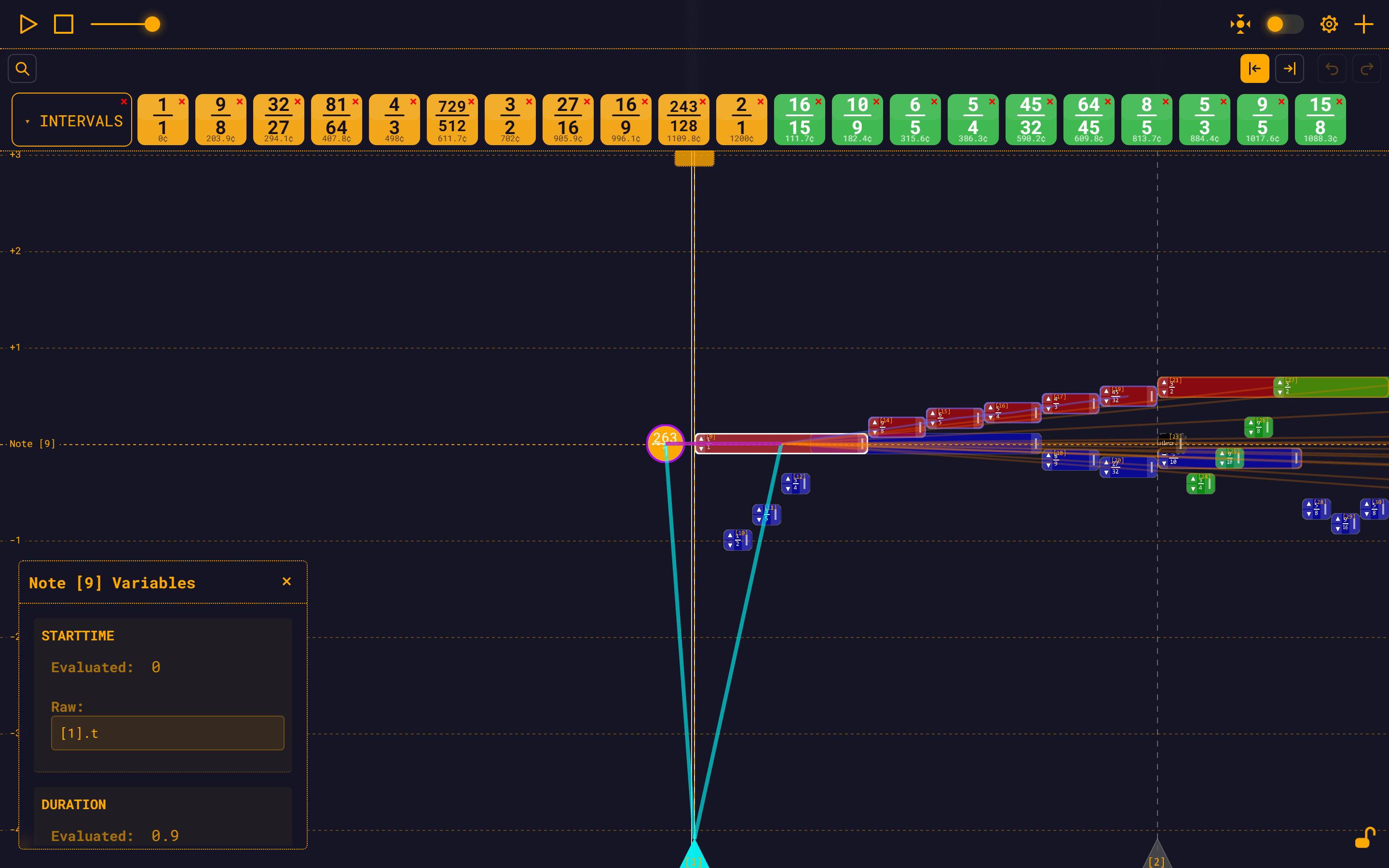
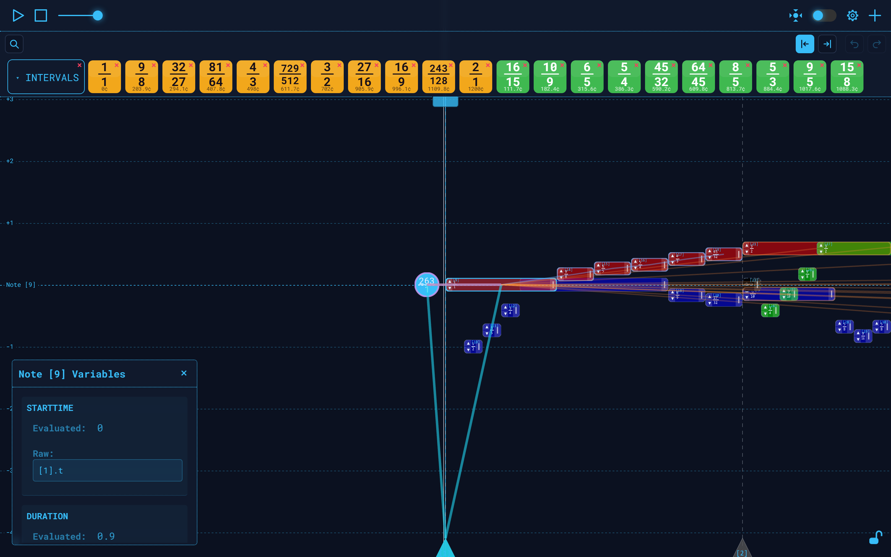
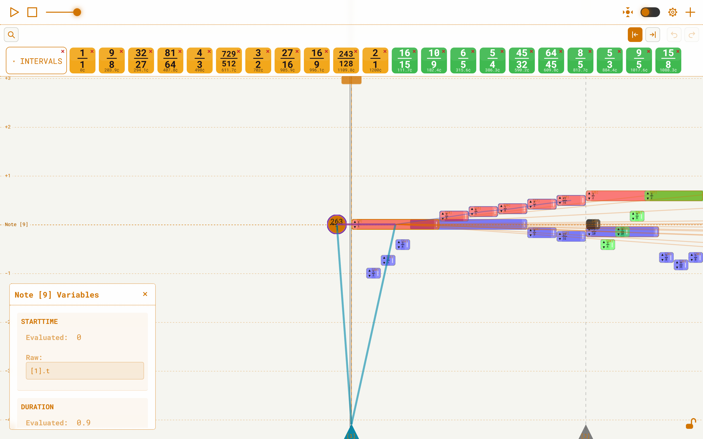
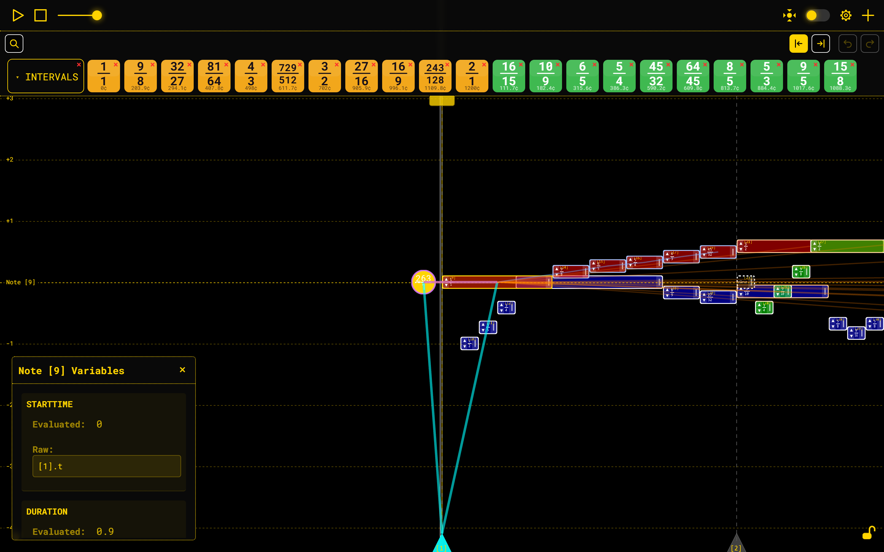
Each preset's accent, background and note-border colours:
| Theme | Accent | Background | Note border |
|---|---|---|---|
| Classic Orange | #ffa800 | #151525 | #636363 |
| Slate Cyan | #38bdf8 | #0b1120 | #5a6a85 |
| Mono Light | #d17400 | #f5f5f0 | #9a9a92 |
| High Contrast | #ffd400 | #000000 | #ffffff |
Picking a theme discards your custom colours — and re-seeds the geometry sliders.
Selecting a preset applies its full colour set and clears every colour override you have made, with no confirmation, so the preset shows cleanly. It also writes the preset's declared note geometry over the three sliders below. Choose your theme first, then customize.
There is no automatic light mode.
The app does not follow your operating system's light/dark preference. If you want a light interface, pick Mono Light by hand. Note also that the page paints in Classic Orange for a moment on every load before your theme is applied, so a Mono Light user will see a brief dark flash.
Note geometry
Three sliders under the theme dropdown reshape every note on the canvas. They apply live. Each preset declares its own geometry, and switching presets re-seeds the sliders with it — High Contrast, for instance, lands a 2 px border and 4 px corners. Anything you drag afterwards sticks until the next preset switch.
| Slider | Range | Default | What it changes |
|---|---|---|---|
| Note height | 8–60, step 1 | 22 wu | How thick a note's bar is, in world units. |
| Border thickness | 0–6, step 0.5 | 1 px | The outline around every note. Set it to 0 for no border. |
| Corner radius | 0–20, step 1 | 6 px | How rounded a note's corners are. Set it to 0 for square notes. |
Note height is the master dimension. The ID label, the fraction text, the arrow column and the pull tab on a note are all sized as fractions of it — so raising the note height makes a note's whole interior bigger, not just taller. If a dense passage is unreadable, raise it; if you want to see more of the piece at once, lower it.
Custom colours
Below the sliders sit 15 colour pickers, grouped under Interface, Workspace and Dependency highlights. Each shows a swatch and the hex value beside it. Pick a colour and it applies continuously as you drag, saved as you go.
Overrides are sparse: you only override the tokens you actually touch, and everything else keeps following the preset.
Every picker changes something. What each one recolours:
| Picker | What it recolours |
|---|---|
| Accent | Almost all of the interface — buttons, borders, panel titles, glows — plus, on the canvas: the BaseNote circle, the note ID labels, the BaseNote's fraction, the octave guide lines, the measure-triangle labels, and the marquee rectangle you drag when multi-selecting. This is the one big lever. |
| Background | The canvas and page background, and input backgrounds. |
| Panel surface | The translucent backing of the bars and panels. |
| Panel border | The outlines of inputs, chips and buttons inside the panels. |
| Text | Primary text — including all the text drawn on notes: fraction labels, the word "silence", the ▲/▼ arrow glyphs, and the BaseNote's fraction. |
| Muted text | Secondary text — hints, readouts, inactive tab labels. |
| Active / delete | The danger colour: destructive buttons, active toggle states, the gear when Settings is open. |
| Note border | The outline of every note, the dashed ring around a silence, and the BaseNote circle's border. |
| Playhead | The playhead line. |
| Measure bars | The measure bars — dashed interior and solid start/end alike. |
| Selection ring | The ring and wash on a selected note, the ring around a multi-selected group, and the outline of a selected BaseNote or measure triangle. |
| Hover ring | The ring under your cursor — on notes, the BaseNote and measure triangles. |
| Frequency, Start time, Duration | The dependency highlight rings and the dependency link lines, per property. |
Reset colors to theme
The button at the bottom of the tab drops all your colour overrides and restores the current theme's colours. It is greyed out when you have none. It asks first, telling you how many custom colours it is about to discard, and it is irreversible.
It touches colours only — your note height, border thickness and corner radius are left alone. To reset those too, use Reset this tab.
What is not themed
One thing on the canvas is deliberately not part of the theme.
Note colours are your data, not the theme's. Every note carries its own colour: a new note takes the colour of the note it was created against, or a random hue if there is none (the preset does set that random hue's saturation). You change it on the note's COLOR row in the note widget, by typing a value — hex, rgb(), rgba(), hsl(), hsla() or a named colour — and saving. A theme change never repaints your notes, which is the point: the colours you chose to tell one voice from another survive a change of skin.
Mono Light has its own feedback colours.
Selection and hover feedback follow the preset's tokens, so on Mono Light the selection ring is burnt-orange (#d17400), the hover ring dark grey (#333333) and on-note text near-black — no white-on-white.
Next
- Settings — the other four tabs of the panel
- Note Widget — where a note's own colour is set
- Workspace — the canvas the theme is drawn on